How to analyse FACS data
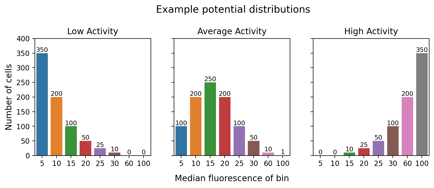
When we put cells on the sorter, we are measuring them on 1 dimension: fluorescence (whether that is GFP or GFP/RFP or something else). Our goal is to measure each tile’s true average fluorescence value. We cannot determine the true measured fluoresence score of every cell (that would be a LOT of tubes), so we sort them into usually 4-8 different tubes depending on their fluorescence score. Each tube or ‘bin’ is defined by the median fluorescence value of the cells sorted into it. So for each tile, we end up with a discrete distribution of the number of cells at one of the 4-8 measured positions.
# @hide2
import seaborn as sns
import matplotlib.pyplot as plt

fig, axes = plt.subplots(1,3, dpi = 200, figsize = (10,3), sharey = True)

axes[0].set_ylim(0,400)

sns.barplot(x = [5,10,15,20,25,30,60,100], y = [350,200,100,50,25,10,0,0], ax = axes[0])
sns.barplot(x = [5,10,15,20,25,30,60,100], y = [100,200,250,200,100,50,10,1], ax = axes[1])
sns.barplot(x = [5,10,15,20,25,30,60,100], y = [0,0,10,25,50,100,200,350], ax = axes[2])

for ax in axes:
    for container in ax.containers:
        ax.bar_label(container, fontsize = 9)

axes[0].set_ylabel("Number of cells", size = 12)

axes[0].set_title("Low Activity")
axes[1].set_title("Average Activity")
axes[2].set_title("High Activity")

axes[1].set_xlabel("Median fluorescence of bin", labelpad = 10, size = 12)

fig.suptitle("Example potential distributions", y = 1.1, x = 0.515, size = 14)
Text(0.515, 1.1, 'Example potential distributions')